Navigation: Welcome >
Manual Conventions


|
Navigation: Welcome > Manual Conventions |
|
This manual attempts to follow these conventions. We use the word attempts because we are human and therefore fallible.
Topic Header
|
Chapter Heading
Menu: Databases>Projects
Default keyboard shortcut: None
Function:
A description of the function goes here.
Photos and Screenshots
Screen shots may appear with older version branding than that of WireCAD v5.1. Please forgive us this. This allows us to spend more time on the program and less time on the documentation. Where new functions are included look for this symbol:
Noteworthy Changes
Items or functions that are significantly different from previous versions will be flagged with this symbol:
Normal Paragraph Text
Normal paragraph text appears like this.
Text You Must Type or Enter
In the event that you are required to enter text the instruction will be formatted as follows:
Please enter the path to the project in the textbox.
How To Topics
How to do something
| 1. | You must do something. |
| 2. | Then something else. |
Notes
Please Note: Notes will look like this.
Text That Identifies or Explains a Graphic

This is the Aerial Viewer
Button Presses
When you are Instructed to press a button  and the button graphic is not shown the text will be formatted as in the following example:
Press the <Next> button to continue.
Menu Button Presses
Menu button presses will be formatted using the > symbol to indicate subsequent menu levels. If you are required to select a specific function or tab the ~ character will be used to indicate a selection to make once the form, dialog, or function executes. For example:
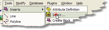
Will be displayed as: Click Tools>Inserts>Insert... ~ <OK> Then follow the directions...
Field Names or Other Program Labels
Field Names and Labels.
Warnings
In the event that we feel something is important or could possibly damage a project or drawing we will issue warnings as follows:
|
Please do not press this <button>. Bad things will happen! |
Tips
Tips are displayed as follows:
|
Try pressing this <button>. It might be good! |
What we Call Things
Button
 Text Box or textbox.
 Combo box or dropdown. Clicking the arrow on the right will drop a scrollable list.
 Tabs or tab collection. When prompted to select a tab the caption text will appear as follows: Select the Find Equipment tab.
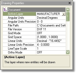 Property List. Information about the active property is displayed at the bottom of the list. Highlighting a property causes it to enter edit mode. You can then enter data in the field on the right.
Please Note: the field on the right-hand side of the property list may be referred to as a textbox, combo or dropdown depending on its type and function.
 Ellipsis button. Pressing this button in what ever the current context will bring up a context sensitive dialog.
 Checkbox.
 Expando-button. When the cursor is over this button and it is enabled the button will turn red. Clicking it will expand the present view.
 Listbox.


